
時系列モデルと言えば、ARIMAモデルです。最近では、FacebookのProphetモデルも人気です。
ThymeBoostは、時系列分解(トレンド成分・季節成分・など)と勾配ブースティング(XGBoostなど)を組み合わせた、時系列モデルを構築するPython パッケージです。
ただ、開発中のため日々進化していますし、今後大きく使い方が変わる可能性を秘めています。
今回は「Python ThymeBoost でさくっと勾配ブーステッド時系列モデル(A Gradient Boosted Time-Series Model)を作ろう!」というお話しです。
ちなみに、時系列解析の理論的なお話は出てきません……
Contents
- ThymeBoostのインストール
- 利用するデータセット
- 構築する予測モデル(時系列モデル)
- 予測精度評価で利用する指標
- 必要なライブラリーの読み込み
- Australian wine sales(オーストラリアのワイン販売量)
- Australian wine sales|データセットの読み込み
- Australian wine sales|学習データとテストデータに分割
- Australian wine sales|ARIMAモデル
- Australian wine sales|Prophetモデル
- Australian wine sales|ThymeBoostモデル
- Australian wine sales|ThymeBoost(ARIMA)モデル
- Australian wine sales|予測精度比較
- Airline Passengers(飛行機乗客数)
- Airline Passengers|データセットの読み込み
- Airline Passengers|学習データとテストデータに分割
- Airline Passengers|ARIMAモデル
- Airline Passengers|Prophetモデル
- Airline Passengers|ThymeBoostモデル
- Airline Passengers|ThymeBoost(ARIMA)モデル
- Airline Passenger|予測精度比較
- まとめ
ThymeBoostのインストール
コマンドプロンプト上で、pipでインストールするときのコードは以下です。
pip install ThymeBoost
利用するデータセット
時系列解析系のサンプルデータとしよく活用されている、以下のデータセット2つを使います。
- Australian wine sales(オーストラリアのワイン販売量) ※月単位の時系列データ
- Airline Passengers(飛行機乗客数) ※月単位の時系列データ
構築する予測モデル(時系列モデル)
以下の4つの予測モデルを作り、予測精度を比較します。
- ARIMAモデル
- Prophetモデル
- ThymeBoostモデル
- ThymeBoost(ARIMA)モデル
ARIMAモデルは、pmdarimaパッケージを使い構築します(AutoARIMA)。Prophetモデルは、fbprophetパッケージを使い構築します。
ThymeBoostパッケージで2種類の予測モデルを構築します。自動構築機能(autofit)を使い構築したThymeBoostモデルと、pmdarimaパッケージを使い求めたARIMAモデルの次数を使って構築したThymeBoost(ARIMA)モデルです。
pmdarimaパッケージとfbprophetパッケージを、インストールしていない方は、以下の記事を参考にインストールし使えるようにしてください。
Pythonでサクッと作れる時系列の予測モデルNeuralProphet(≒FacebookのProphet × Deep Learning)
予測精度評価で利用する指標
学習データで予測モデルを構築し、テストデータで精度検証していきます。
予測精度評価で利用する指標は、平均絶対誤差(MAE、Mean Absolute Error)と平均絶対パーセント誤差(MAPE、Mean absolute percentage error)です。
以下の記号を使い精度指標の説明をします。
- y_i^{actual} ・・・i番目の実測値
- y_i^{pred} ・・・i番目の予測値
- \overline{y^{actual}} ・・・実測値の平均
- n ・・・実測値・予測値の数
■ 二乗平均平方根誤差(RMSE、Root Mean Squared Error)
\sqrt{\frac{1}{n}\sum_{i=1}^n(y_i^{actual}-{y_i^{pred}})^2}■ 平均絶対誤差(MAE、Mean Absolute Error)
\frac{1}{n}\sum_{i=1}^n|y_i^{actual}-{y_i^{pred}}|■ 平均絶対パーセント誤差(MAPE、Mean absolute percentage error)
\frac{1}{n}\sum_{i=1}^n|\frac{y_i^{actual}-{y_i^{pred}}}{y_i^{actual}}|
必要なライブラリーの読み込み
先ずは、必要なライブラリー一式を読み込みます。
以下、コードです。
# ライブラリーの読み込み
import numpy as np
import pandas as pd
import pmdarima as pm
from pmdarima import datasets
from pmdarima import arima
from pmdarima import model_selection
from fbprophet import Prophet
from ThymeBoost import ThymeBoost as tb
from sklearn.metrics import mean_absolute_error
from statistics import mean
from matplotlib import pyplot as plt

# グラフのスタイルとサイズ
plt.style.use('ggplot')
plt.rcParams['figure.figsize'] = [12, 9]
Australian wine sales(オーストラリアのワイン販売量)
Australian wine sales|データセットの読み込み
Australian wine sales(オーストラリアのワイン販売量)は、1980年1月から1994年8月までのオーストラリアのワインメーカーによるワイン販売を記録した月単位のデータです。
先ず、データセットを読み込みます。
以下、コードです。
# データの読み込み
data = datasets.load_wineind(as_series=True)
読み込んだデータセットをグラフで確認してみます。
以下、コードです。
# グラフ(折れ線)
plt.plot(range(len(data)),data)
以下、実行結果です。
Australian wine sales|学習データとテストデータに分割
予測モデルを構築する学習データと、構築した予測モデルを検証するためのテストデータに分割します。
時系列データですので、ある時期を境に2つのデータに分割します。
今回は、新しい12ヶ月(1年間)のデータをテストデータとし、その前のデータを学習データとします。
- 学習データ:1行目から164行目
- テストデータ:165行目から176行目
では、データを分割します。以下、コードです。
# データ分割(train:学習データ、test:テストデータ)
train, test = model_selection.train_test_split(data, train_size=len(data)-12)
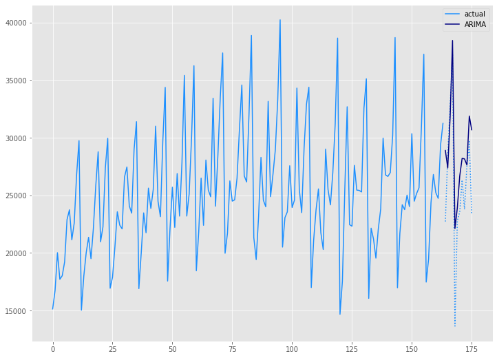
Australian wine sales|ARIMAモデル
学習データ(train)を使い、ARIMAモデルを自動構築します。
以下、コードです。
# モデル構築(Auto ARIMA)
arima_model = pm.auto_arima(train,
                            seasonal=True,
                            m=12,
                            n_jobs=-1)
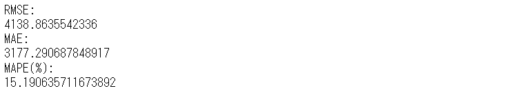
構築したモデルをテストデータ(test)を使い精度評価します。
以下、コードです。
# 予測(Auto ARIMA)
arima_preds = arima_model.predict(n_periods=len(test))
# 予測精度(Auto ARIMA)
arima_rmse = mean((test - arima_preds)**2)**.5
arima_mae = mean_absolute_error(test, arima_preds)
arima_mape = mean(abs(test - arima_preds)/test)*100
print('RMSE:')
print(arima_rmse)
print('MAE:')
print(arima_mae)
print('MAPE(%):')
print(arima_mape)
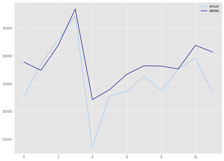
# 予測値グラフ(Auto ARIMA)
x_axis = range(len(test))
plt.plot(x_axis,test,label="actual",color='#1e90ff', linestyle='dotted')
plt.plot(x_axis,arima_preds, label='ARIMA',color='#000080')
plt.legend()
plt.show()
以下、実行結果です。
学習データ(train)の期間も含めグラフ化してみます。
以下、コードです。
# グラフ(学習データとテストデータ、予測結果)
x_axis = np.arange(len(data))
plt.plot(x_axis[:len(train)],train,color='#1e90ff',label="actual")
plt.plot(x_axis[len(train):],test,color='#1e90ff', linestyle='dotted')
plt.plot(x_axis[len(train):],arima_preds, label='ARIMA',color='#000080')
plt.legend()
plt.show()
以下、実行結果です。
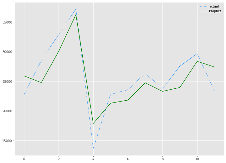
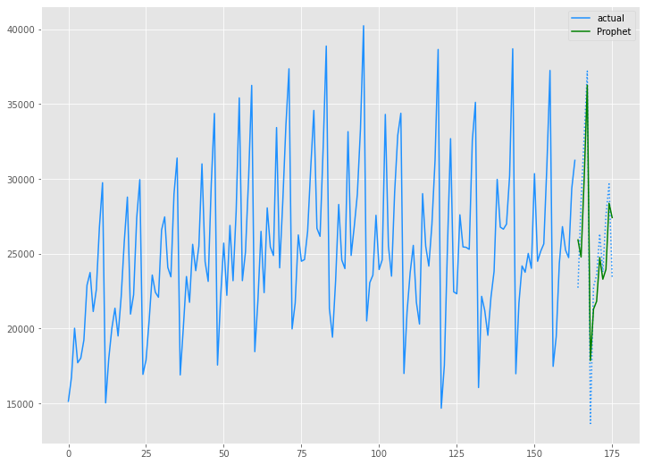
Australian wine sales|Prophetモデル
学習データ(train)を使い、Prophrtモデルを構築します。
以下、コードです。
# Prophet用データセット準備(Prophet)
prophet_train = train
prophet_train = prophet_train.reset_index()
prophet_train.columns = ['ds', 'y']

# モデル構築(Prophet)
prophet = Prophet(seasonality_mode='multiplicative')
prophet.fit(prophet_train)
構築したモデルをテストデータ(test)を使い精度評価します。
以下、コードです。
# 予測(Prophet)
future = prophet.make_future_dataframe(periods=len(test), freq='M')
prophet_forecast = prophet.predict(future)
prophet_preds = prophet_forecast['yhat'].iloc[-len(test):]

# 予測精度(Prophet)
prophet_rmse = mean((test - prophet_preds.values)**2)**.5
prophet_mae = mean_absolute_error(test, prophet_preds.values)
prophet_mape = mean(abs(test - prophet_preds.values)/test)*100

print('RMSE:')
print(prophet_rmse)
print('MAE:')
print(prophet_mae)
print('MAPE(%):')
print(prophet_mape)

# 予測値グラフ(Prophet)
x_axis = range(len(test))
plt.plot(x_axis,test,label="actual",color='#1e90ff', linestyle='dotted')
plt.plot(x_axis,prophet_preds.values, label='Prophet',color='g')
plt.legend()
plt.show()
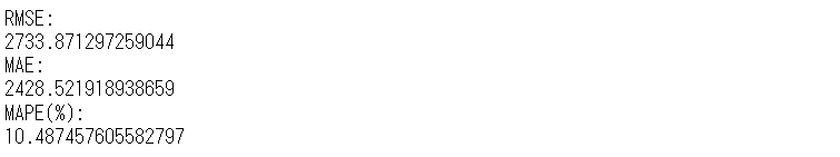
学習データ(train)の期間も含めグラフ化してみます。
以下、コードです。
# グラフ(学習データとテストデータ、予測結果)
x_axis = np.arange(len(data))
plt.plot(x_axis[:len(train)],train,color='#1e90ff',label="actual")
plt.plot(x_axis[len(train):],test,color='#1e90ff', linestyle='dotted')
plt.plot(x_axis[len(train):],prophet_preds.values, label='Prophet',color='g')
plt.legend()
plt.show()
以下、実行結果です。
Australian wine sales|ThymeBoostモデル
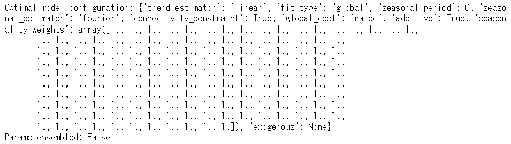
学習データ(train)を使い、ThymeBoostモデルを構築します。
以下、コードです。
# モデル構築(ThymeBoost)
boosted_model = tb.ThymeBoost(verbose=0)
boosted_model_output = boosted_model.autofit(train,
                                             seasonal_period=12
                                            )
以下、実行結果です。
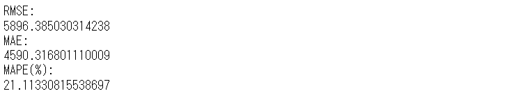
構築したモデルをテストデータ(test)を使い精度評価します。
以下、コードです。
# 予測(ThymeBoost)
predicted_output = boosted_model.predict(boosted_model_output,
len(test))
tb_preds = predicted_output['predictions']
# 予測精度(ThymeBoost)
tb_rmse = mean((test - tb_preds.values)**2)**.5
tb_mae = mean_absolute_error(test, tb_preds.values)
tb_mape = mean(abs(test - tb_preds.values)/test)*100
print('RMSE:')
print(tb_rmse)
print('MAE:')
print(tb_mae)
print('MAPE(%):')
print(tb_mape)
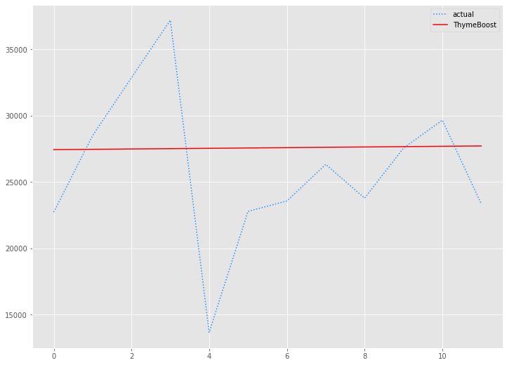
# 予測値グラフ(ThymeBoost)
x_axis = range(len(test))
plt.plot(x_axis,test,label="actual",color='#1e90ff', linestyle='dotted')
plt.plot(x_axis,tb_preds.values, label='ThymeBoost',color='r')
plt.legend()
plt.show()
以下、実行結果です。
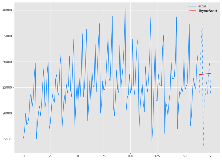
学習データ(train)の期間も含めグラフ化してみます。
以下、コードです。
# グラフ(学習データとテストデータ、予測結果)
x_axis = np.arange(len(data))
plt.plot(x_axis[:len(train)],train,color='#1e90ff',label="actual")
plt.plot(x_axis[len(train):],test,color='#1e90ff', linestyle='dotted')
plt.plot(x_axis[len(train):],tb_preds.values, label='ThymeBoost',color='r')
plt.legend()
plt.show()
以下、実行結果です。
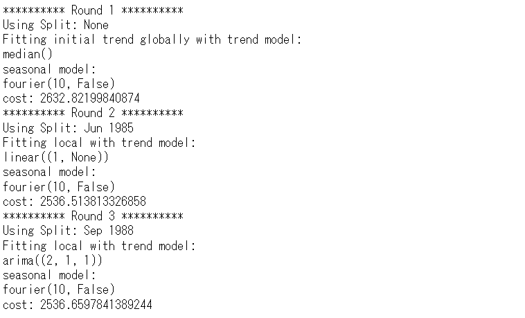
Australian wine sales|ThymeBoost(ARIMA)モデル
学習データ(train)を使い、ARIMAの3つの次数(ARの次数、Iの次数、MAの次数)を組み込んだThymeBoostモデルを構築します。
先ず、pmdarimaパッケージをのAutoARIMAを使い、ARIMAの3つの次数(ARの次数、Iの次数、MAの次数)を求めます。
以下、コードです。
# モデル構築(Auto ARIMA)
pm.auto_arima(train,
              seasonal=False,
              m=12,
              n_jobs=-1)
以下、実行結果です。

求めたARIMAの3つの次数(2,1,1)を組み込んだThymeBoostモデルを構築します。
以下、コードです。
# モデル構築(ThymeBoost × ARIMA)
boosted_model = tb.ThymeBoost(approximate_splits=True,
                              verbose=1,
                              cost_penalty=.001,
                              n_rounds=3
                             )
boosted_model_output = boosted_model.fit(train,
                                         additive=True,
                                         trend_estimator=['linear','arima'],
                                         arima_order=(2, 1, 1),
                                         seasonal_estimator='fourier',
                                         seasonal_period=12
                                        )
以下、実行結果です。
構築したモデルをテストデータ(test)を使い精度評価します。
以下、コードです。
# 予測(ThymeBoost × ARIMA)
predicted_output = boosted_model.predict(boosted_model_output,
len(test))
tb2_preds = predicted_output['predictions']
# 予測精度(ThymeBoost × ARIMA)
tb2_rmse = mean((test - tb2_preds.values)**2)**.5
tb2_mae = mean_absolute_error(test, tb2_preds.values)
tb2_mape = mean(abs(test - tb2_preds.values)/test)*100
print('RMSE:')
print(tb2_rmse)
print('MAE:')
print(tb2_mae)
print('MAPE(%):')
print(tb2_mape)
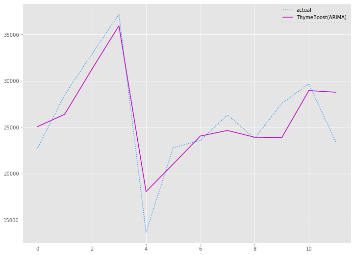
# 予測値グラフ(ThymeBoost × ARIMA)
x_axis = range(len(test))
plt.plot(x_axis,test,label="actual",color='#1e90ff', linestyle='dotted')
plt.plot(x_axis,tb2_preds.values, label='ThymeBoost(ARIMA)',color='m')
plt.legend()
plt.show()
以下、実行結果です。

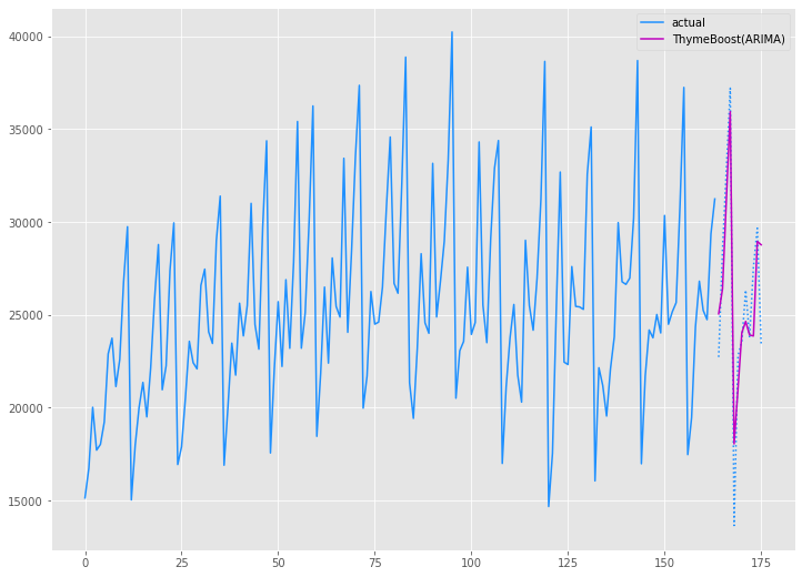
学習データ(train)の期間も含めグラフ化してみます。
以下、コードです。
# グラフ(学習データとテストデータ、予測結果)
x_axis = np.arange(len(data))
plt.plot(x_axis[:len(train)],train,color='#1e90ff',label="actual")
plt.plot(x_axis[len(train):],test,color='#1e90ff', linestyle='dotted')
plt.plot(x_axis[len(train):],tb2_preds.values, label='ThymeBoost(ARIMA)',color='m')
plt.legend()
plt.show()
以下、実行結果です。
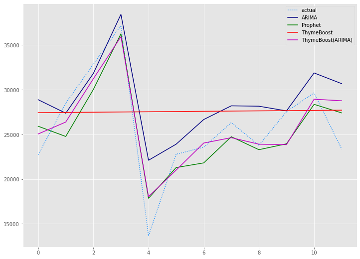
Australian wine sales|予測精度比較
今回、以下の4つの予測モデルを作りました。
- ARIMAモデル
- Prophetモデル
- ThymeBoostモデル
- ThymeBoost(ARIMA)モデル
以下、4つのモデルの予測精度です。
| RMSE | MAE | MAPE(%) | |
| ARIMA | 4,139 | 3,177 | 15.19% |
| Prophet | 2,734 | 2,429 | 10.49% |
| ThymeBoost | 5,896 | 4,590 | 21.11% |
| ThymeBoost(ARIMA) | 2,631 | 2,133 | 9.49% |
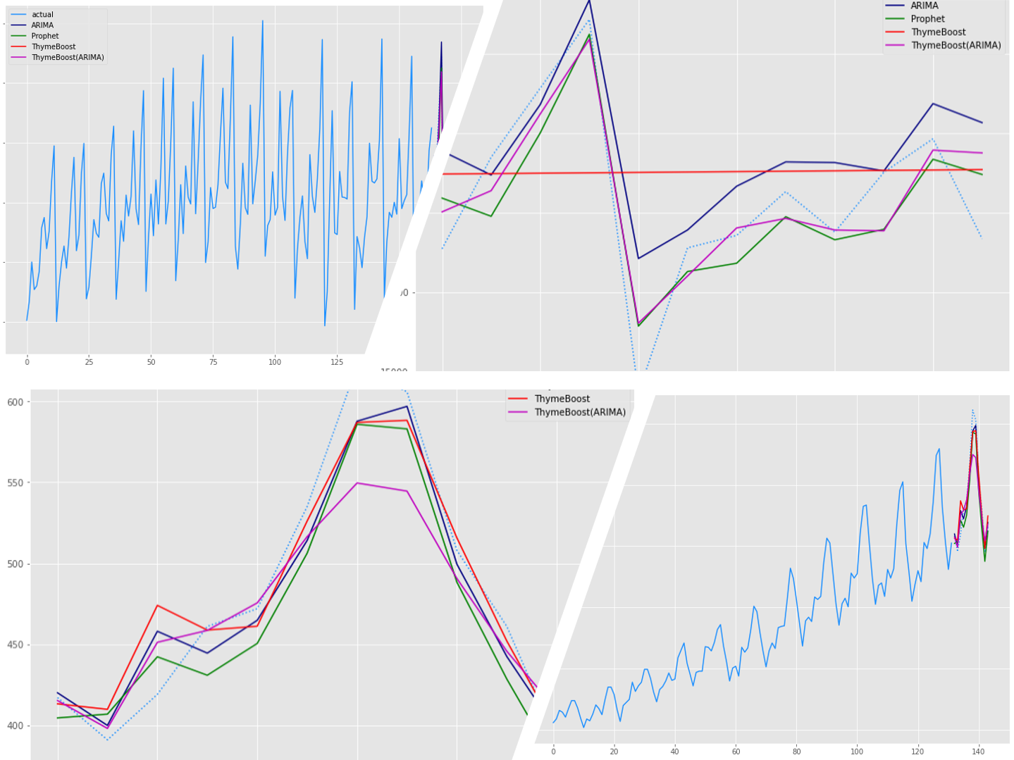
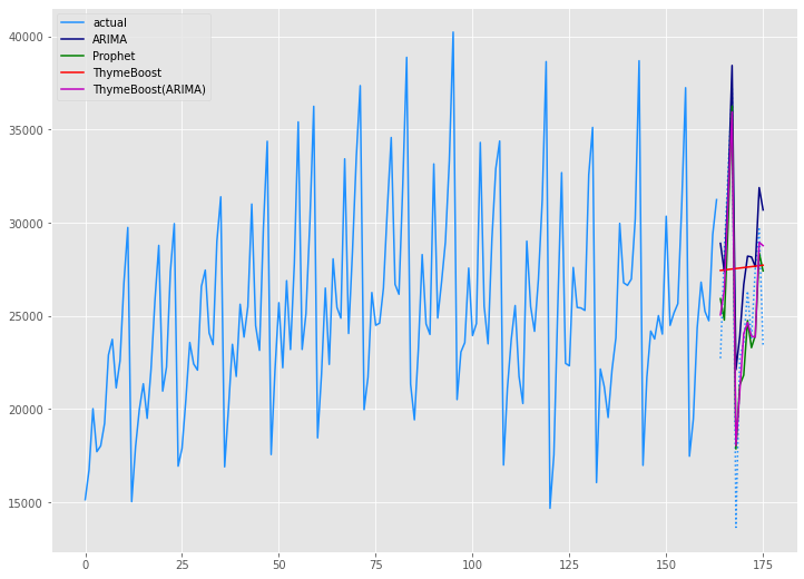
テストデータ(test)の期間のグラフです。
以下、コードです。
# 予測値グラフ
x_axis = range(len(test))
plt.plot(x_axis,test,label="actual",color='#1e90ff', linestyle='dotted')
plt.plot(x_axis,arima_preds, label='ARIMA',color='#000080')
plt.plot(x_axis,prophet_preds.values, label='Prophet',color='g')
plt.plot(x_axis,tb_preds.values, label='ThymeBoost',color='r')
plt.plot(x_axis,tb2_preds.values, label='ThymeBoost(ARIMA)',color='m')
plt.legend()
plt.show()
以下、実行結果です。
学習データ(train)の期間も含めグラフ化してみます。
以下、コードです。
# グラフ(学習データとテストデータ、予測結果)
x_axis = np.arange(len(data))
plt.plot(x_axis[:len(train)],train,color='#1e90ff',label="actual")
plt.plot(x_axis[len(train):],test,color='#1e90ff', linestyle='dotted')
plt.plot(x_axis[len(train):],arima_preds, label='ARIMA',color='#000080')
plt.plot(x_axis[len(train):],prophet_preds.values, label='Prophet',color='g')
plt.plot(x_axis[len(train):],tb_preds.values, label='ThymeBoost',color='r')
plt.plot(x_axis[len(train):],tb2_preds.values, label='ThymeBoost(ARIMA)',color='m')
plt.legend()
plt.show()
以下、実行結果です。
Airline Passengers(飛行機乗客数)
Airline Passengers|データセットの読み込み
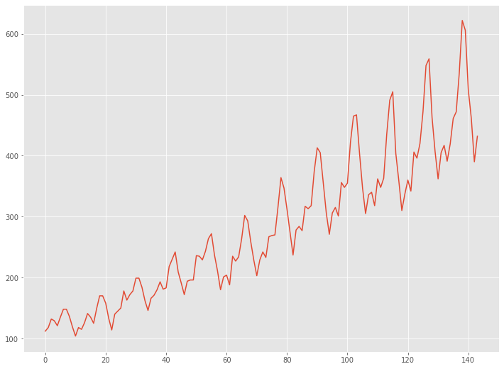
Airline Passengers(飛行機乗客数)は、1949年から1960年までの国際航空旅客の月単位のデータです。
先ず、データセットを読み込みます。
以下、コードです。
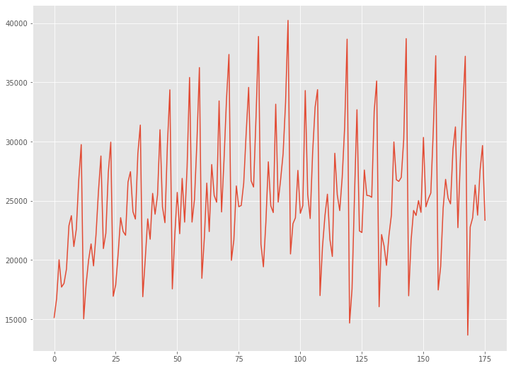
# データの読み込み
url = 'https://raw.githubusercontent.com/tblume1992/ThymeBoost/main/ThymeBoost/Datasets/AirPassengers.csv'
df = pd.read_csv(url)
df.index = pd.to_datetime(df['Month'])
data = df['#Passengers']
読み込んだデータセットをグラフで確認してみます。
以下、コードです。
# グラフ(折れ線)
plt.plot(range(len(data)),data)
以下、実行結果です。
Airline Passengers|学習データとテストデータに分割
予測モデルを構築する学習データと、構築した予測モデルを検証するためのテストデータに分割します。
時系列データですので、ある時期を境に2つのデータに分割します。
今回は、新しい12ヶ月(1年間)のデータをテストデータとし、その前のデータを学習データとします。
- 学習データ:1行目から132行目
- テストデータ:133行目から144行目
では、データを分割します。以下、コードです。
# データ分割(train:学習データ、test:テストデータ)
train, test = model_selection.train_test_split(data, train_size=len(data)-12)
Airline Passengers|ARIMAモデル
学習データ(train)を使い、ARIMAモデルを自動構築します。
以下、コードです。
# モデル構築(Auto ARIMA)
arima_model = pm.auto_arima(train,
                            seasonal=True,
                            m=12,
                            n_jobs=-1)
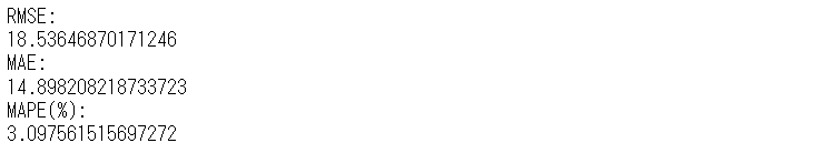
構築したモデルをテストデータ(test)を使い精度評価します。
以下、コードです。
# 予測(Auto ARIMA)
arima_preds = arima_model.predict(n_periods=len(test))
# 予測精度(Auto ARIMA)
arima_rmse = mean((test - arima_preds)**2)**.5
arima_mae = mean_absolute_error(test, arima_preds)
arima_mape = mean(abs(test - arima_preds)/test)*100
print('RMSE:')
print(arima_rmse)
print('MAE:')
print(arima_mae)
print('MAPE(%):')
print(arima_mape)
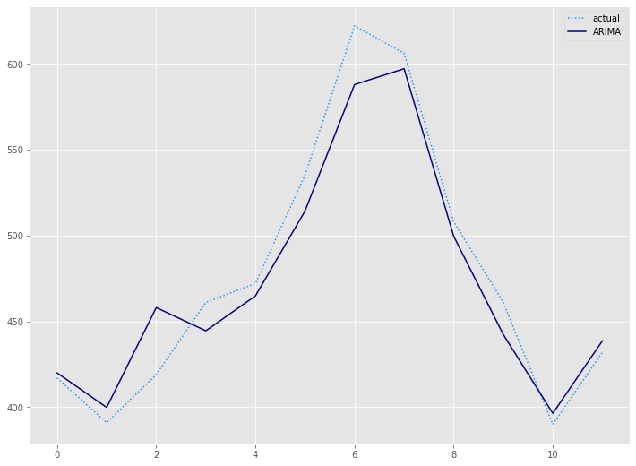
# 予測値グラフ(Auto ARIMA)
x_axis = range(len(test))
plt.plot(x_axis,test,label="actual",color='#1e90ff', linestyle='dotted')
plt.plot(x_axis,arima_preds, label='ARIMA',color='#000080')
plt.legend()
plt.show()
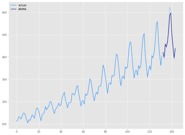
以下、実行結果です。
学習データ(train)の期間も含めグラフ化してみます。
以下、コードです。
# グラフ(学習データとテストデータ、予測結果)
x_axis = np.arange(len(data))
plt.plot(x_axis[:len(train)],train,color='#1e90ff',label="actual")
plt.plot(x_axis[len(train):],test,color='#1e90ff', linestyle='dotted')
plt.plot(x_axis[len(train):],arima_preds, label='ARIMA',color='#000080')
plt.legend()
plt.show()
以下、実行結果です。
Airline Passengers|Prophetモデル
学習データ(train)を使い、Prophrtモデルを構築します。
以下、コードです。
# Prophet用データセット準備(Prophet)
prophet_train = train
prophet_train = prophet_train.reset_index()
prophet_train.columns = ['ds', 'y']

# モデル構築(Prophet)
prophet = Prophet(seasonality_mode='multiplicative')
prophet.fit(prophet_train)
構築したモデルをテストデータ(test)を使い精度評価します。
以下、コードです。
# 予測(Prophet)
future = prophet.make_future_dataframe(periods=len(test), freq='M')
prophet_forecast = prophet.predict(future)
prophet_preds = prophet_forecast['yhat'].iloc[-len(test):]
# 予測精度(Prophet)
prophet_rmse = mean((test - prophet_preds.values)**2)**.5
prophet_mae = mean_absolute_error(test, prophet_preds.values)
prophet_mape = mean(abs(test - prophet_preds.values)/test)*100
print('RMSE:')
print(prophet_rmse)
print('MAE:')
print(prophet_mae)
print('MAPE(%):')
print(prophet_mape)
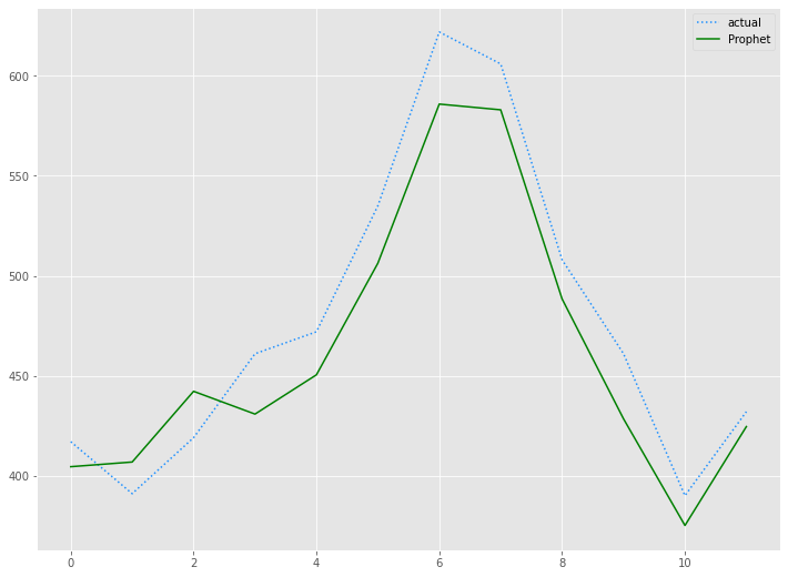
# 予測値グラフ(Prophet)
x_axis = range(len(test))
plt.plot(x_axis,test,label="actual",color='#1e90ff', linestyle='dotted')
plt.plot(x_axis,prophet_preds.values, label='Prophet',color='g')
plt.legend()
plt.show()
以下、実行結果です。
以下、コードです。
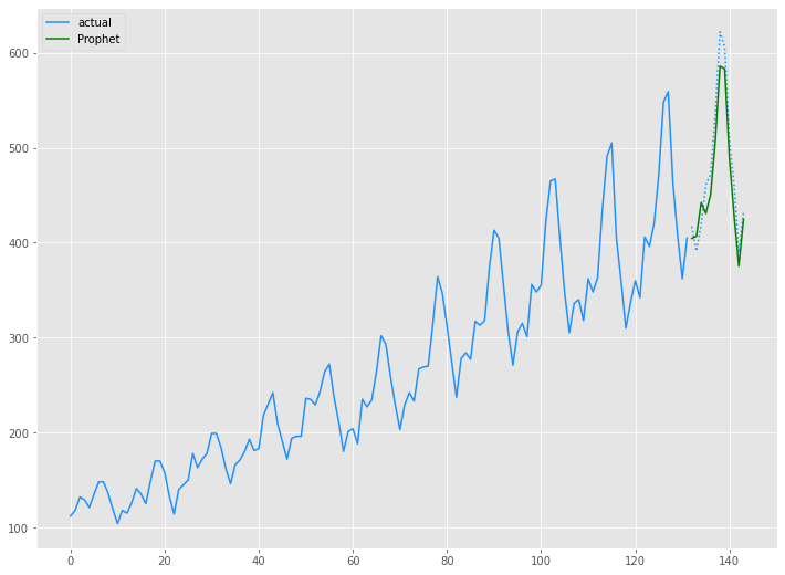
# グラフ(学習データとテストデータ、予測結果)
x_axis = np.arange(len(data))
plt.plot(x_axis[:len(train)],train,color='#1e90ff',label="actual")
plt.plot(x_axis[len(train):],test,color='#1e90ff', linestyle='dotted')
plt.plot(x_axis[len(train):],prophet_preds.values, label='Prophet',color='g')
plt.legend()
plt.show()
以下、実行結果です。
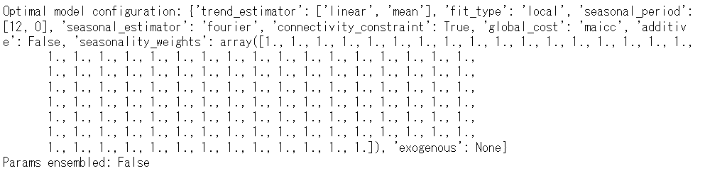
Airline Passengers|ThymeBoostモデル
学習データ(train)を使い、ThymeBoostモデルを構築します。
以下、コードです。
# モデル構築(ThymeBoost)
boosted_model = tb.ThymeBoost(verbose=0)
boosted_model_output = boosted_model.autofit(train,
                                             seasonal_period=12
                                            )
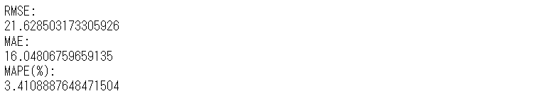
構築したモデルをテストデータ(test)を使い精度評価します。
以下、コードです。
# 予測(ThymeBoost)
predicted_output = boosted_model.predict(boosted_model_output,
len(test))
tb_preds = predicted_output['predictions']
# 予測精度(ThymeBoost)
tb_rmse = mean((test - tb_preds.values)**2)**.5
tb_mae = mean_absolute_error(test, tb_preds.values)
tb_mape = mean(abs(test - tb_preds.values)/test)*100
print('RMSE:')
print(tb_rmse)
print('MAE:')
print(tb_mae)
print('MAPE(%):')
print(tb_mape)
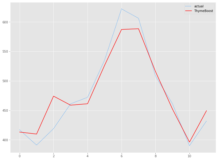
# 予測値グラフ(ThymeBoost)
x_axis = range(len(test))
plt.plot(x_axis,test,label="actual",color='#1e90ff', linestyle='dotted')
plt.plot(x_axis,tb_preds.values, label='ThymeBoost',color='r')
plt.legend()
plt.show()
以下、実行結果です。
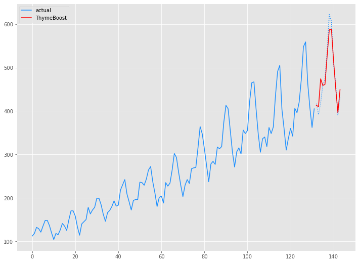
学習データ(train)の期間も含めグラフ化してみます。
以下、コードです。
# グラフ(学習データとテストデータ、予測結果)
x_axis = np.arange(len(data))
plt.plot(x_axis[:len(train)],train,color='#1e90ff',label="actual")
plt.plot(x_axis[len(train):],test,color='#1e90ff', linestyle='dotted')
plt.plot(x_axis[len(train):],tb_preds.values, label='ThymeBoost',color='r')
plt.legend()
plt.show()
以下、実行結果です。
Airline Passengers|ThymeBoost(ARIMA)モデル
学習データ(train)を使い、ARIMAの3つの次数(ARの次数、Iの次数、MAの次数)を組み込んだThymeBoostモデルを構築します。
先ず、pmdarimaパッケージをのAutoARIMAを使い、ARIMAの3つの次数(ARの次数、Iの次数、MAの次数)を求めます。
以下、コードです。
# モデル構築(Auto ARIMA)
pm.auto_arima(train,
              seasonal=False,
              m=12,
              n_jobs=-1)
以下、実行結果です。
![]()
求めたARIMAの3つの次数(2,1,2)を組み込んだThymeBoostモデルを構築します。
以下、コードです。
# モデル構築(ThymeBoost × ARIMA)
boosted_model = tb.ThymeBoost(approximate_splits=True,
                              verbose=1,
                              cost_penalty=.001,
                              n_rounds=3
                             )
boosted_model_output = boosted_model.fit(train,
                                         additive=True,
                                         trend_estimator=['linear','arima'],
                                         arima_order=(2, 1, 1),
                                         seasonal_estimator='fourier',
                                         seasonal_period=12
                                        )
以下、実行結果です。
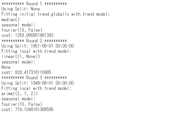
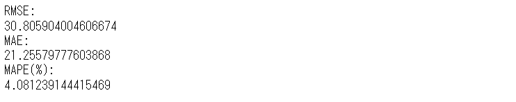
構築したモデルをテストデータ(test)を使い精度評価します。
以下、コードです。
# 予測(ThymeBoost × ARIMA)
predicted_output = boosted_model.predict(boosted_model_output,
len(test))
tb2_preds = predicted_output['predictions']
# 予測精度(ThymeBoost × ARIMA)
tb2_rmse = mean((test - tb2_preds.values)**2)**.5
tb2_mae = mean_absolute_error(test, tb2_preds.values)
tb2_mape = mean(abs(test - tb2_preds.values)/test)*100
print('RMSE:')
print(tb2_rmse)
print('MAE:')
print(tb2_mae)
print('MAPE(%):')
print(tb2_mape)
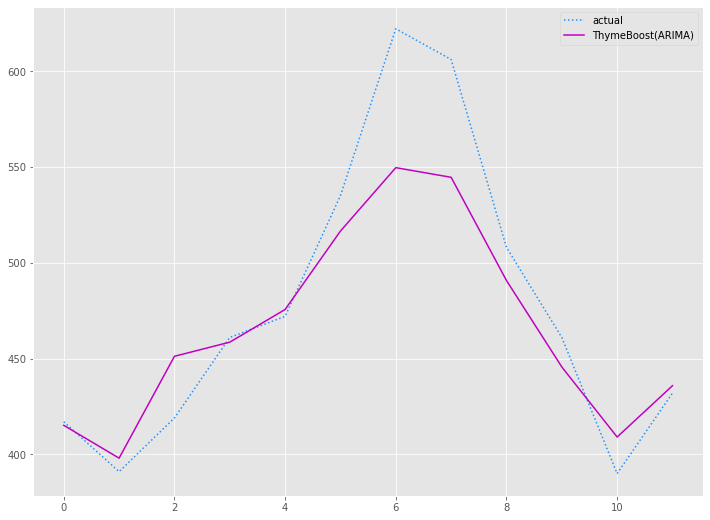
# 予測値グラフ(ThymeBoost × ARIMA)
x_axis = range(len(test))
plt.plot(x_axis,test,label="actual",color='#1e90ff', linestyle='dotted')
plt.plot(x_axis,tb2_preds.values, label='ThymeBoost(ARIMA)',color='m')
plt.legend()
plt.show()
以下、実行結果です。
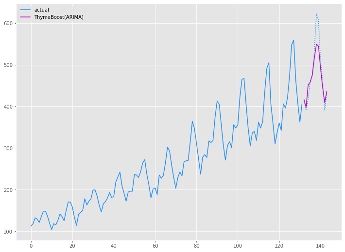
学習データ(train)の期間も含めグラフ化してみます。
以下、コードです。
# グラフ(学習データとテストデータ、予測結果)
x_axis = np.arange(len(data))
plt.plot(x_axis[:len(train)],train,color='#1e90ff',label="actual")
plt.plot(x_axis[len(train):],test,color='#1e90ff', linestyle='dotted')
plt.plot(x_axis[len(train):],tb2_preds.values, label='ThymeBoost(ARIMA)',color='m')
plt.legend()
plt.show()
以下、実行結果です。
Airline Passenger|予測精度比較
今回、以下の4つの予測モデルを作りました。
- ARIMAモデル
- Prophetモデル
- ThymeBoostモデル
- ThymeBoost(ARIMA)モデル
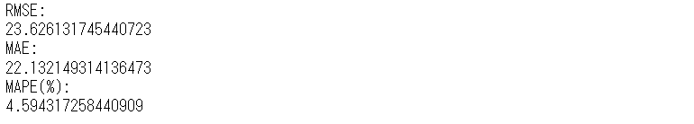
以下、4つのモデルの予測精度です。
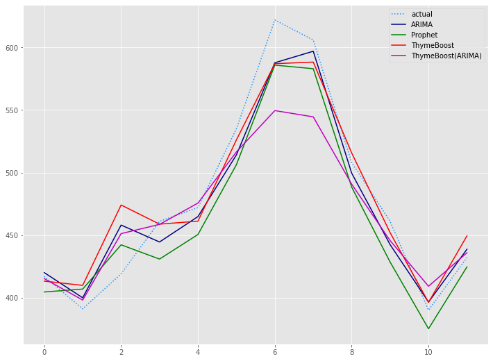
| RMSE | MAE | MAPE(%) | |
| ARIMA | 19 | 15 | 3.09% |
| Prophet | 24 | 22 | 4.59% |
| ThymeBoost | 22 | 16 | 3.41% |
| ThymeBoost(ARIMA) | 31 | 21 | 4.08% |
テストデータ(test)の期間のグラフです。
以下、コードです。
# 予測値グラフ
x_axis = range(len(test))
plt.plot(x_axis,test,label="actual",color='#1e90ff', linestyle='dotted')
plt.plot(x_axis,arima_preds, label='ARIMA',color='#000080')
plt.plot(x_axis,prophet_preds.values, label='Prophet',color='g')
plt.plot(x_axis,tb_preds.values, label='ThymeBoost',color='r')
plt.plot(x_axis,tb2_preds.values, label='ThymeBoost(ARIMA)',color='m')
plt.legend()
plt.show()
以下、実行結果です。
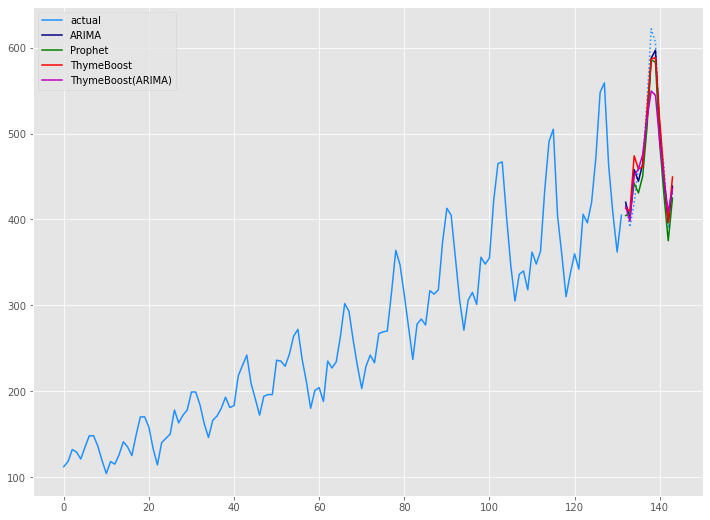
学習データ(train)の期間も含めグラフ化してみます。
以下、コードです。
# グラフ(学習データとテストデータ、予測結果)
x_axis = np.arange(len(data))
plt.plot(x_axis[:len(train)],train,color='#1e90ff',label="actual")
plt.plot(x_axis[len(train):],test,color='#1e90ff', linestyle='dotted')
plt.plot(x_axis[len(train):],arima_preds, label='ARIMA',color='#000080')
plt.plot(x_axis[len(train):],prophet_preds.values, label='Prophet',color='g')
plt.plot(x_axis[len(train):],tb_preds.values, label='ThymeBoost',color='r')
plt.plot(x_axis[len(train):],tb2_preds.values, label='ThymeBoost(ARIMA)',color='m')
plt.legend()
plt.show()
以下、実行結果です。
まとめ
今回は「Python ThymeBoost でさくっと勾配ブーステッド時系列モデル(A Gradient Boosted Time-Series Model)を作ろう!」というお話しをしました。
ただ、ThymeBoost はまだまだ開発中のため日々進化していますし、今後大きく使い方が変わる可能性を秘めています。
色々な時系列モデルが登場しますが、ARIMAは相変わらずそこそこ強いな…… という感じです。