
データを入手したとき、先ずすべきは探索的データ分析(EDA)です。
この探索的データ分析(EDA)で必ず実施するのが、データビジュアライゼーションです。
要は、グラフやチャートなどを作成し、データの特徴や関係性などを見える化することです。
Pythonにはそのためのライブラリーがいくつもありますが、その中で比較的よく使うであろうライブラリーにSeabornというものがあります。
seaborn: statistical data visualization
Seabornがどんなものか知るために、ちょっといじってみるのが早道です。
今回は、「Seabornで比較的よく使うデータビジュアライゼーション7選」ということで、Seabornで比較的よく出力する以下のグラフなどを紹介いたします。
- ヒストグラム(Histogram)
- バープロット(Bar plot)
- ボックスプロット(Box plot)
- バイオリンプロット(Violin Plot)
- 散布図(Scatter plot)
- 相関ペアプロット(Pair plot)
- 相関ヒートマップ(Heatmap)
Contents
ライブラリーのインストール
まだSeabornをインストールされていない方は、インストールしておいてください。
ちなみに、AnacondaなどでPythonをインストールすると、一緒にSeabornがインストールされていることが多いです。
condaでインストールするときは以下です。
conda install -c conda-forge seaborn
pipでインストールするときは以下です。
pip install seaborn
準備
モジュールの読み込み
先ずは、利用するモジュールを読み込みます。
以下、コードです。
# 必要なモジュールの読み込み

from sklearn.datasets import fetch_openml
import seaborn as sns
import matplotlib.pyplot as plt
データセットの読み込み
今回は、Car Salesのデータセットを使います。
以下は、変数名です。
- Manufacturer
- Model
- Sales_in_thousands
- __year_resale_value
- Vehicle_type
- Price_in_thousands
- Engine_size
- Horsepower
- Wheelbase
- Width
- Length
- Curb_weight
- Fuel_capacity
- Fuel_efficiency
- Latest_Launch
- Power_perf_factor
Car Salesのデータセットを読み込みます。
以下、コードです。
# データセットの読み込み

dataset = fetch_openml(data_id=43619, parser='auto')

df = dataset['frame']

print(df) #確認
以下、実行結果です。
    Manufacturer    Model  Sales_in_thousands  __year_resale_value  \
0          Acura  Integra              16.919               16.360
1          Acura       TL              39.384               19.875
2          Acura       CL              14.114               18.225
3          Acura       RL               8.588               29.725
4           Audi       A4              20.397               22.255
..           ...      ...                 ...                  ...
152        Volvo      V40               3.545                  NaN
153        Volvo      S70              15.245                  NaN
154        Volvo      V70              17.531                  NaN
155        Volvo      C70               3.493                  NaN
156        Volvo      S80              18.969                  NaN

    Vehicle_type  Price_in_thousands  Engine_size  Horsepower  Wheelbase  \
0      Passenger               21.50          1.8       140.0      101.2
1      Passenger               28.40          3.2       225.0      108.1
2      Passenger                 NaN          3.2       225.0      106.9
3      Passenger               42.00          3.5       210.0      114.6
4      Passenger               23.99          1.8       150.0      102.6
..           ...                 ...          ...         ...        ...
152    Passenger               24.40          1.9       160.0      100.5
153    Passenger               27.50          2.4       168.0      104.9
154    Passenger               28.80          2.4       168.0      104.9
155    Passenger               45.50          2.3       236.0      104.9
156    Passenger               36.00          2.9       201.0      109.9

     Width  Length  Curb_weight  Fuel_capacity  Fuel_efficiency Latest_Launch  \
0     67.3   172.4        2.639           13.2             28.0      2/2/2012
1     70.3   192.9        3.517           17.2             25.0      6/3/2011
2     70.6   192.0        3.470           17.2             26.0      1/4/2012
3     71.4   196.6        3.850           18.0             22.0     3/10/2011
4     68.2   178.0        2.998           16.4             27.0     10/8/2011
..     ...     ...          ...            ...              ...           ...
152   67.6   176.6        3.042           15.8             25.0     9/21/2011
153   69.3   185.9        3.208           17.9             25.0    11/24/2012
154   69.3   186.2        3.259           17.9             25.0     6/25/2011
155   71.5   185.7        3.601           18.5             23.0     4/26/2011
156   72.1   189.8        3.600           21.1             24.0    11/14/2011

     Power_perf_factor
0            58.280150
1            91.370778
2                  NaN
3            91.389779
4            62.777639
..                 ...
152          66.498812
153          70.654495
154          71.155978
155         101.623357
156          85.735655

[157 rows x 16 columns]
読み込んだデータセットの、変数の状況を確認します。
以下、コードです。
# 変数の状況

df.info()
以下、実行結果です。
<class 'pandas.core.frame.DataFrame'>
RangeIndex: 157 entries, 0 to 156
Data columns (total 16 columns):
 #   Column               Non-Null Count  Dtype
---  ------               --------------  -----
 0   Manufacturer         157 non-null    object
 1   Model                157 non-null    object
 2   Sales_in_thousands   157 non-null    float64
 3   __year_resale_value  121 non-null    float64
 4   Vehicle_type         157 non-null    object
 5   Price_in_thousands   155 non-null    float64
 6   Engine_size          156 non-null    float64
 7   Horsepower           156 non-null    float64
 8   Wheelbase            156 non-null    float64
 9   Width                156 non-null    float64
 10  Length               156 non-null    float64
 11  Curb_weight          155 non-null    float64
 12  Fuel_capacity        156 non-null    float64
 13  Fuel_efficiency      154 non-null    float64
 14  Latest_Launch        157 non-null    object
 15  Power_perf_factor    155 non-null    float64
dtypes: float64(12), object(4)
memory usage: 19.8+ KB
floatが量的変数で、objectが質的変数です。
Non-Null Count(有効データ数)が変数によって異なっています。欠測値(値がない)が混じっていることが伺えます。
欠測値数を数えてみます。
以下、コードです。
# 変数の欠測値の数

df.isnull().sum()
以下、実行結果です。
Manufacturer            0
Model                   0
Sales_in_thousands      0
__year_resale_value    36
Vehicle_type            0
Price_in_thousands      2
Engine_size             1
Horsepower              1
Wheelbase               1
Width                   1
Length                  1
Curb_weight             2
Fuel_capacity           1
Fuel_efficiency         3
Latest_Launch           0
Power_perf_factor       2
dtype: int64
変数「__year_resale_value」の欠測値の数は「32」と、他の変数と比べ多いです。
欠測値処理を実施し、テーブルデータを整えていきます。
欠測値処理
先ずは、欠測値の数が他の変数に比べ多い変数「__year_resale_value」を、データセットから除外します。
以下、コードです。
# 欠測値の多い変数('__year_resale_value')の削除

df = df.drop('__year_resale_value', axis=1)
再度、欠測値数を数えてみます。
以下、コードです。
# 変数の欠測値の数

df.isnull().sum()
以下、実行結果です。
Manufacturer          0
Model                 0
Sales_in_thousands    0
Vehicle_type          0
Price_in_thousands    2
Engine_size           1
Horsepower            1
Wheelbase             1
Width                 1
Length                1
Curb_weight           2
Fuel_capacity         1
Fuel_efficiency       3
Latest_Launch         0
Power_perf_factor     2
dtype: int64
少しだけ欠測値のある変数が散見されます。
欠測値のある変数を除外するという方法もありますが、他にも方法があります。
それは、欠測値のあるレコード(行)を除外する、という方法です。
どのレコード(行)に欠測値があるのか見てみます。
以下、コードです。
# 欠測値のあるレコード(行)

bool_list = df.isnull().any(axis=1)

print(bool_list) #確認
以下、実行結果です。欠測値のあるレコード(行)がTrueになっています。
0      False
1      False
2       True
3      False
4      False
       ...
152    False
153    False
154    False
155    False
156    False
Length: 157, dtype: bool
Trueの数を数えてみます。
以下、コードです。
# 欠測値のあるレコード(行)の数

print(bool_list.sum())
以下、実行結果です。
5
欠測値のあるレコード(行)は5行です。
このレコード(行)を除外します。
以下、コードです。
# 欠測値のあるレコード(行)の削除

df = df[bool_list==False]
再度、変数の状況を確認します。
以下、コードです。
# 変数の状況(再確認)

print(df.info())
以下、実行結果です。
<class 'pandas.core.frame.DataFrame'>
Int64Index: 152 entries, 0 to 156
Data columns (total 15 columns):
 #   Column              Non-Null Count  Dtype
---  ------              --------------  -----
 0   Manufacturer        152 non-null    object
 1   Model               152 non-null    object
 2   Sales_in_thousands  152 non-null    float64
 3   Vehicle_type        152 non-null    object
 4   Price_in_thousands  152 non-null    float64
 5   Engine_size         152 non-null    float64
 6   Horsepower          152 non-null    float64
 7   Wheelbase           152 non-null    float64
 8   Width               152 non-null    float64
 9   Length              152 non-null    float64
 10  Curb_weight         152 non-null    float64
 11  Fuel_capacity       152 non-null    float64
 12  Fuel_efficiency     152 non-null    float64
 13  Latest_Launch       152 non-null    object
 14  Power_perf_factor   152 non-null    float64
dtypes: float64(11), object(4)
memory usage: 19.0+ KB
None
すべての変数の有効データ数(Non-Null Count)が一致していることが分かると思います。
このデータセットを使いデータビジュアライゼーションをSeabornで実施していきます。
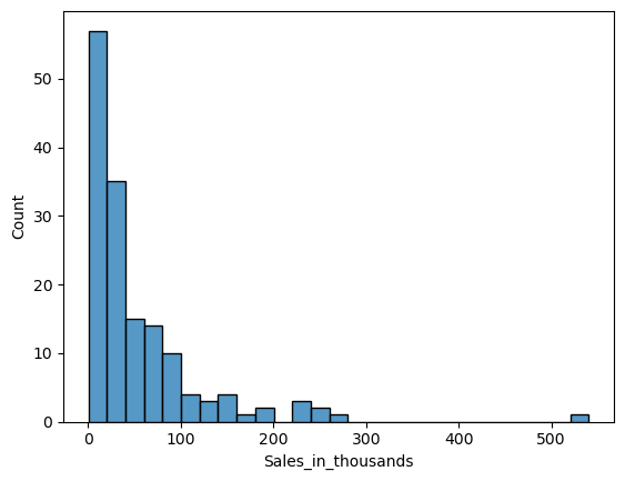
ヒストグラム(Histogram)
ヒストグラム(Histogram)は、量的変数の分布を描きます。
量的変数「Sales_in_thousands」のヒストグラム(Histogram)を作って見ます。
以下、コードです。
sns.histplot(
    x = 'Sales_in_thousands',
    data = df,
)

plt.show()
以下、実行結果です。
パラメータ「bindwidth」で幅を設定できます。
以下、コードです。
sns.histplot(
    x = 'Sales_in_thousands',
    data = df,
    binwidth=100,
)

plt.show()
以下、実行結果です。
「bindwidth」を変えてみます。
以下、コードです。
sns.histplot(
    x = 'Sales_in_thousands',
    data = df,
    binwidth=10,
)

plt.show()
以下、実行結果です。
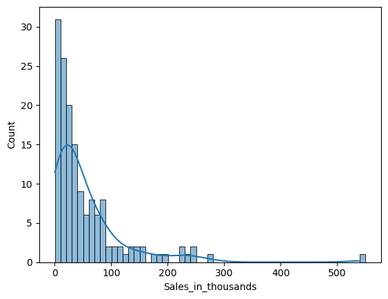
ヒストグラムの分布曲線を描きたいときがあります。パラメータ「kde」にTrueを設定します。
以下、コードです。
sns.histplot(
    x = 'Sales_in_thousands',
    data = df,
    binwidth=10,
    kde=True,
)

plt.show()
以下、実行結果です。
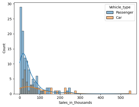
ヒストグラムを層別し、カテゴリ間で比較したいときがあります。パラメータ「hue」に、層別するための質的変数を設定します。
以下、コードです。
sns.histplot(
    x = 'Sales_in_thousands',
    data = df,
    binwidth=10,
    kde=True,
    hue = 'Vehicle_type',
)

plt.show()
以下、実行結果です。
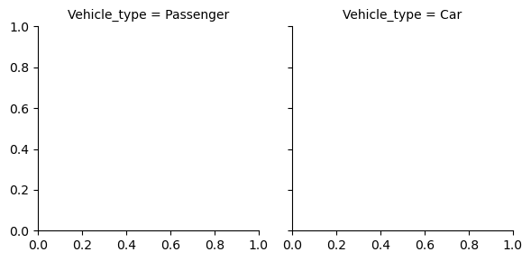
層別ヒストグラムを重ねて表示するのではなく、別々に左右に並べたたり上下に並べたりし、比較したいときがあります。
先ず、そのための枠を作る必要があります。
以下、コードです。
sns.FacetGrid(df, col='Vehicle_type')

plt.show()
以下、実行結果です。
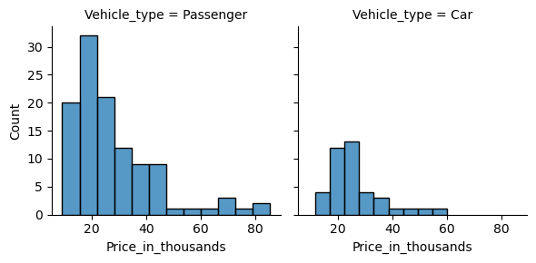
この枠にヒストグラムを表示します。
以下、コードです。
sns.FacetGrid(df, col='Vehicle_type').map(
    sns.histplot,
    'Price_in_thousands',
)

plt.show()
以下、実行結果です。
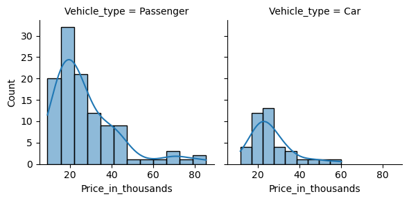
分布の曲線も表示します。
以下、コードです。
sns.FacetGrid(df, col='Vehicle_type').map(
    sns.histplot,
    'Price_in_thousands',
    kde=True,
)

plt.show()
以下、実行結果です。
バープロット(Bar plot)
バープロット(Bar plot)は、量的変数の統計量(平均値など)を棒グラフで表現するものです。
この棒グラフの値は、デフォルトでは平均値になっています。平均値以外の統計量で表現したい場合にはパラメータ「estimator」で設定します。
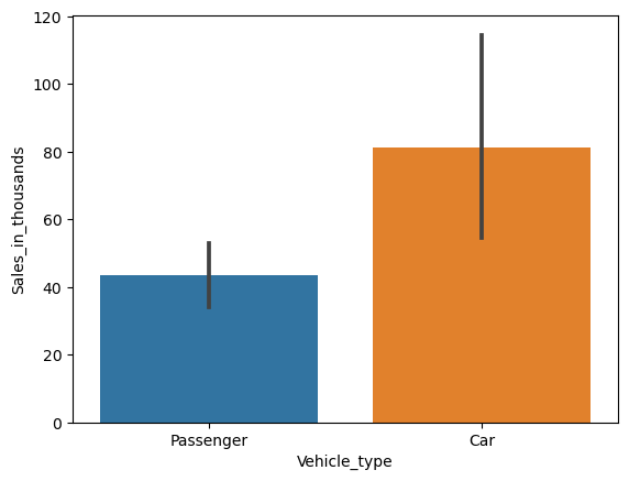
質的変数「Vehicle_type」の値ごと(カテゴリーごと)に、量的変数「Sales_in_thousands」の平均値の棒グラフを作って見ます。
以下、コードです。
sns.barplot(
    x = 'Vehicle_type',
    y = 'Sales_in_thousands',
    data = df,
)

plt.show()
以下、実行結果です。
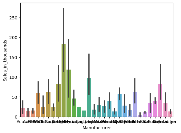
質的変数「Manufacturer」の値ごと(カテゴリーごと)に、量的変数「Sales_in_thousands」の平均値の棒グラフを作って見ます。
以下、コードです。
sns.barplot(
    x = 'Manufacturer',
    y = 'Sales_in_thousands',
    data = df,
)

plt.show()
以下、実行結果です。
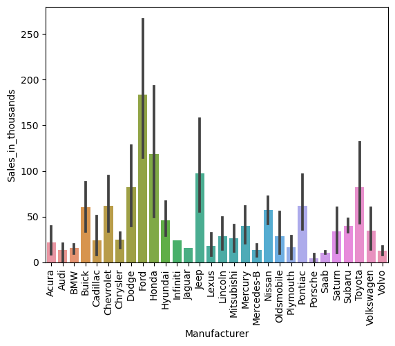
x軸(横軸)のラベルが見れないので、90度回転させて表示させます。
以下、コードです。
ax = sns.barplot(
    x = 'Manufacturer',
    y = 'Sales_in_thousands',
    data = df,
)

plt.xticks(rotation=90)
plt.show()
以下、実行結果です。
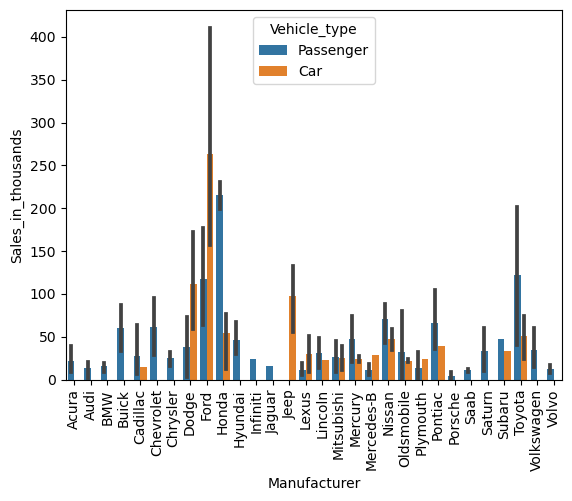
パラメータ「hue」に、層別するための質的変数を設定します。
以下、コードです。
sns.barplot(
    x = 'Manufacturer',
    y = 'Sales_in_thousands',
    data = df,
    hue = 'Vehicle_type',
)

plt.xticks(rotation=90)
plt.show()
以下、実行結果です。
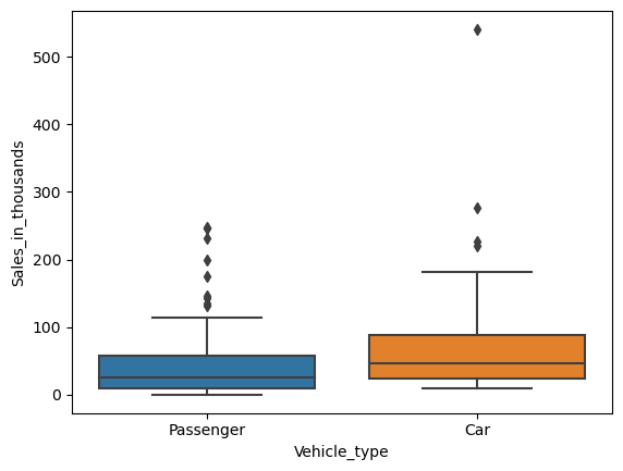
ボックスプロット(Box plot)
ボックスプロット(Box plot)は箱ひげ図と呼ばれているもので、質的変数の値(カテゴリー)間の、量的変数の分布を比較するために使用されます。
- ボックス:四分位数
- ひげの長さ:四分位の外の分布(最小値、最大値)
- 範囲外:外れ値
質的変数「Vehicle_type」の値ごと(カテゴリーごと)に、量的変数「Sales_in_thousands」のボックスプロットを作って見ます。
以下、コードです。
sns.boxplot(
    x = 'Vehicle_type',
    y = 'Sales_in_thousands',
    data = df,
)

plt.show()
以下、実行結果です。
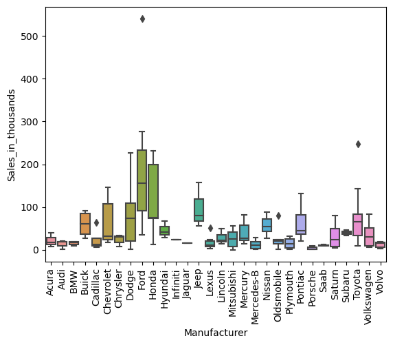
質的変数「Manufacturer」の値ごと(カテゴリーごと)に、量的変数「Sales_in_thousands」のボックスプロットを作って見ます。
以下、コードです。
sns.boxplot(
    x = 'Manufacturer',
    y = 'Sales_in_thousands',
    data = df,
)

plt.xticks(rotation=90)
plt.show()
以下、実行結果です。
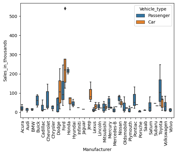
パラメータ「hue」に、層別するための質的変数を設定します。
以下、コードです。
sns.boxplot(
    x = 'Manufacturer',
    y = 'Sales_in_thousands',
    data = df,
    hue = 'Vehicle_type',
)

plt.xticks(rotation=90)
plt.show()
以下、実行結果です。
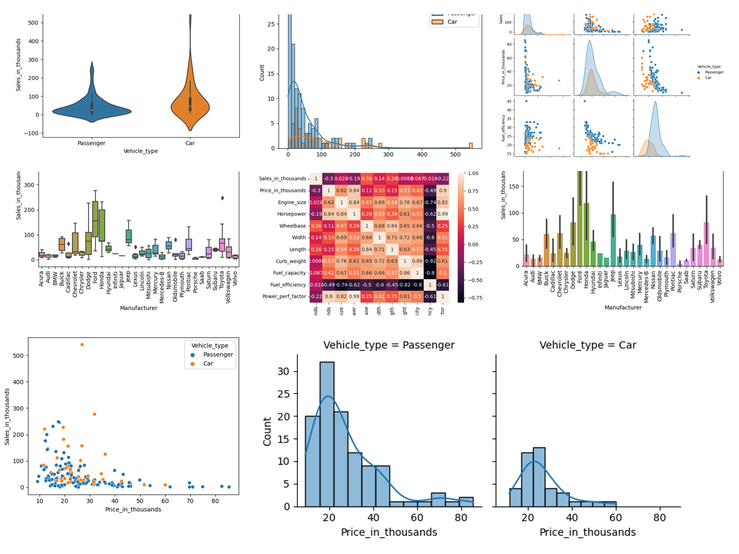
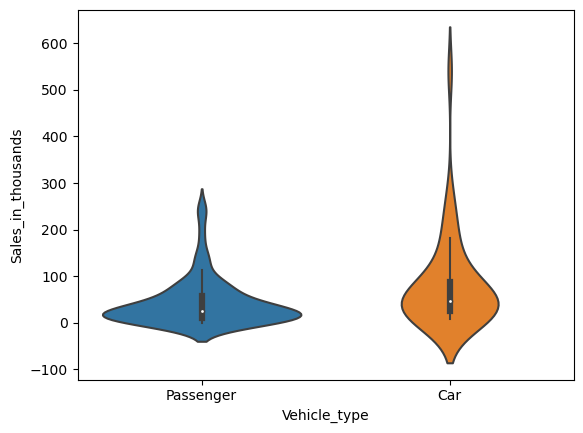
バイオリンプロット(Violin Plot)
バイオリン プロット(Violin Plot)は、ボックス プロットとほぼ同じものを表現しています。
質的変数「Vehicle_type」の値ごと(カテゴリーごと)に、量的変数「Sales_in_thousands」のバイオリン プロットを作って見ます。
以下、コードです。
sns.violinplot(
    x = 'Vehicle_type',
    y = 'Sales_in_thousands',
    data = df,
)

plt.show()
以下、実行結果です。
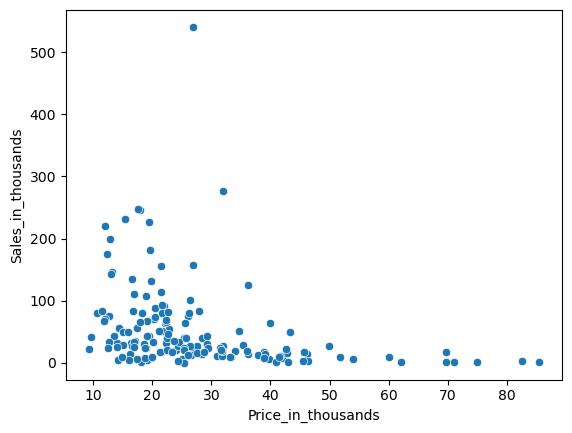
散布図(Scatter plot)
散布図(Scatter plot)は、量的変数間の関係を表現するために使用されます。
量的変数「Price_in_thousands」と量的変数「Sales_in_thousands」の散布図を見てみます。
以下、コードです。
sns.scatterplot(
    x = 'Price_in_thousands',
    y = 'Sales_in_thousands',
    data = df,
)

plt.show()
以下、実行結果です。
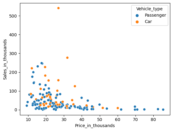
パラメータ「hue」に、層別するための質的変数を設定します。
以下、コードです。
sns.scatterplot(
    x = 'Price_in_thousands',
    y = 'Sales_in_thousands',
    data = df,
    hue = 'Vehicle_type',
)

plt.show()
以下、実行結果です。
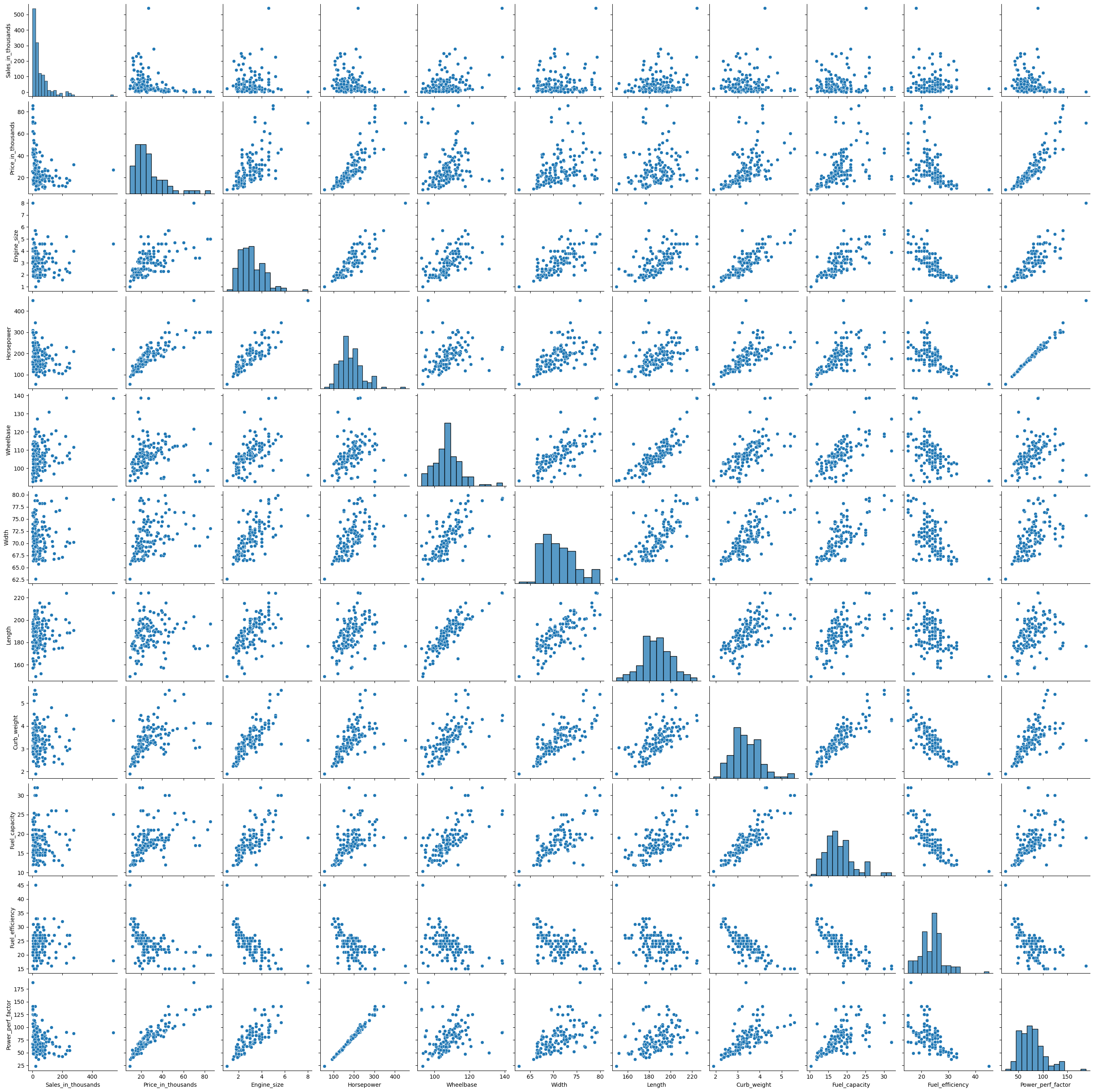
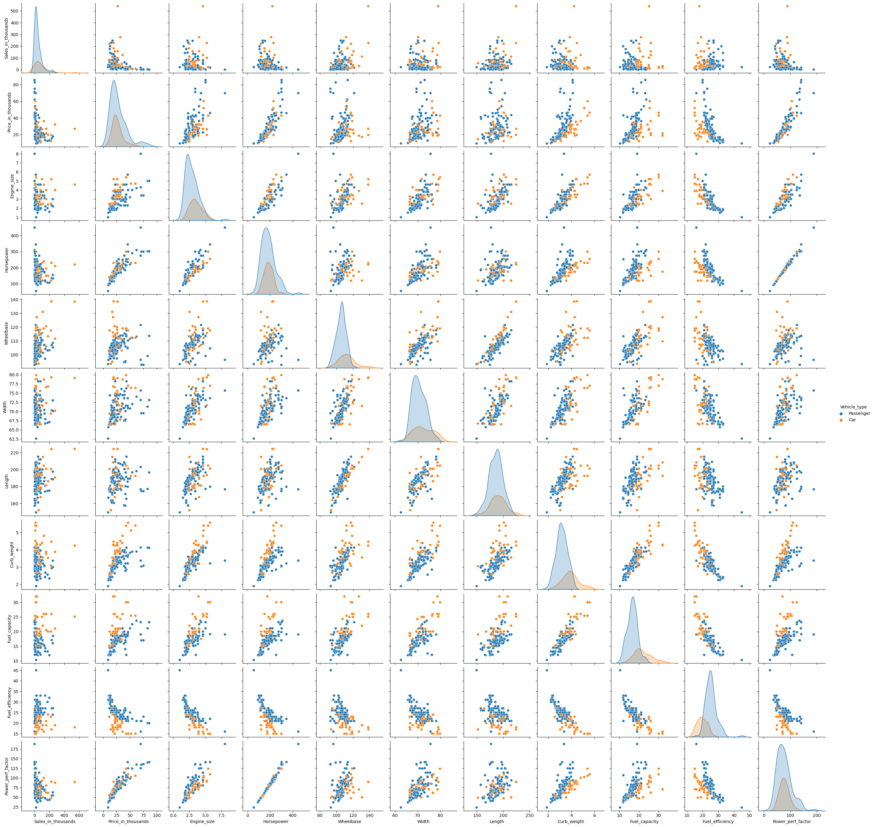
相関ペアプロット(Pair plot)
散布図を1つ1つ作り確認するのもいいですが、先ずは一気に作る方法もあります。
それが相関ペアプロットです。
ちなみに、対角線はヒストグラムなどの各量的変数の分布状況を表しています。
以下、コードです。
sns.pairplot(df)

plt.show()
以下、実行結果です。
パラメータ「hue」に、層別するための質的変数を設定します。
以下、コードです。
sns.pairplot(
    df,
    hue = 'Vehicle_type',
)

plt.show()
以下、実行結果です。
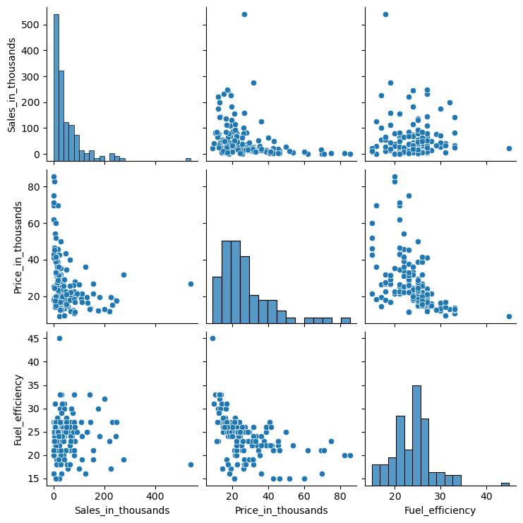
見にくいので、幾つかの変数に絞って見てみます。
先ず利用する変数のリストを作ります。
以下、コードです。
col_list = [
    'Sales_in_thousands','Price_in_thousands','Fuel_efficiency', #量的変数
    'Vehicle_type', #質的変数
]

df2 = df[col_list]
以下、コードです。
sns.pairplot(df2)

plt.show()
以下、実行結果です。
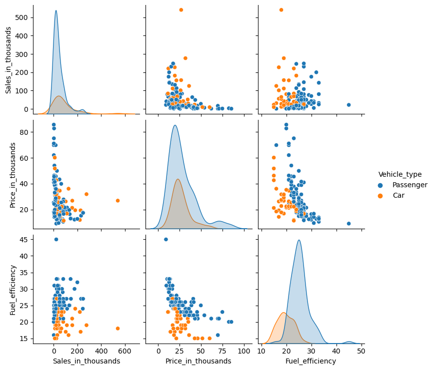
パラメータ「hue」に、層別するための質的変数を設定します。
以下、コードです。
sns.pairplot(
    df2,
    hue = 'Vehicle_type',
)

plt.show()
以下、実行結果です。
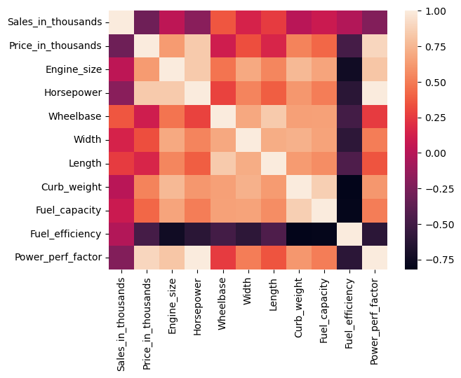
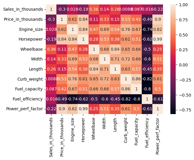
相関ヒートマップ(Heatmap)
散布図と言えば相関係数です。相関ヒートマップとは、相関係数の大小をヒートマップで表現したものです。
以下、コードです。
sns.heatmap(df.corr(numeric_only=True))

plt.show()
以下、実行結果です。
相関係数の値も一緒に表示します。
以下、コードです。
sns.heatmap(
    df.corr(numeric_only=True),
    annot=True,
)

plt.show()
以下、実行結果です。
まとめ
今回は、「Seabornで比較的よく使うデータビジュアライゼーション7選」ということで、Seabornで比較的よく出力する以下のグラフなどを紹介いたしました。
- ヒストグラム(Histogram)
- バープロット(Bar plot)
- ボックスプロット(Box plot)
- バイオリンプロット(Violin Plot)
- 散布図(Scatter plot)
- 相関ペアプロット(Pair plot)
- 相関ヒートマップ(Heatmap)
Seabornも習うよりも慣れろです。
いい感じのグラフなどを作ることができるため、まだ使ったことが無い方は、試してみてください。